
Over the last couple of years, I’ve created visualizations using R, Python, Power BI, Tableau and Qlik. Here are a couple of places where I’ve put these examples.
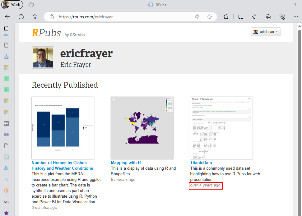
RStudio – as best I can remember, I was thinking about using RPubs to host content 4 years ago. https://rpubs.com/ericfrayer
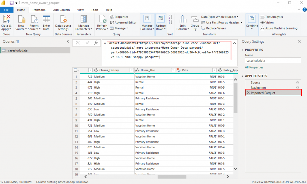
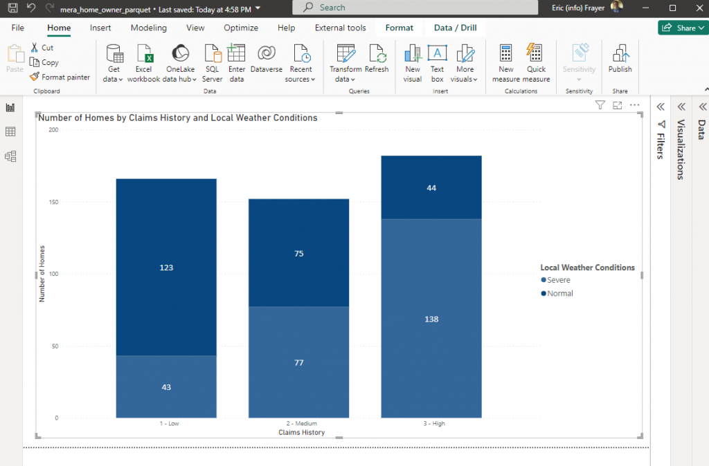
Power BI – Using the same dataset only loaded from a parquet format (ADSL Gen2) into Power BI the same visualization can be created.
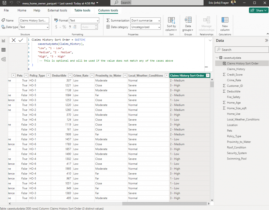
With the data has been loaded into Power BI a simple bar chart visualization can be created.
Python – Of course, this same dataset can be loaded into Python as a csv and using Visual Studio Code yet another visualization can be created.
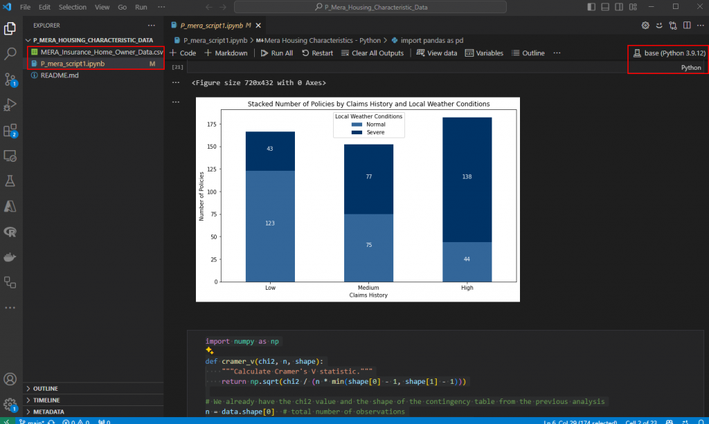
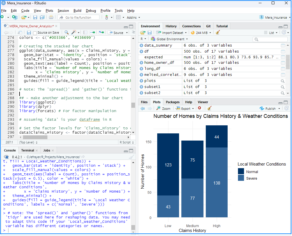
It should be noted, GPT-4 helped with the code and also creating a “statistically significant” relationship in the data with the Local Weather Conditions (either normal or severe) adversely impacting Claims History.